Product Journey Mapping
UI / UX Design
Figma Prototyping
1 X PM
1 x Designer + QA (me)
3 x Software Engineers
Aug 2024 - Nov 2024
401(Play) is a travel and savings employer benefit app that helps employees take time off and save for trips. Employees can allocate funds from their paycheck to go to a 401(Play) debit card, save and plan for trips, and access exclusive flight, hotel, and deals all via the app.
Low user engagement, with less than 5% of employees enrolling into the 401(Play) benefit. This was hindering adoption and revenue growth. We were tasked with increasing employee enrollment and app adoption.
We reduced friction in enrollment and increase benefit accessibility with a mobile iOS / Android app. On initial launch we saw an avg. employee enrollment rate increase by 4.4x from 5% to 22% (with ~89% of enrolled users also signing up for the travel debit card).

First, reimagine and streamline the enrollment to increase employee enrollment rates. Second, improve the employee facing app to grow adoption and engagement.
.avif)
Comparitive analysis of the old/new enrollment user flows and the average task completion times from pre- and post-implementation testing.
Our analysis revealed that the legacy app's enrollment flow had unnecessary steps and some banking integration issues, leading to long task time and user drop-off.
Our solution was to rebuild just the enrollment as a stand-alone responsive web app and reduced the user flow to its minimum number of steps. This improved accessibility and led to 4.4x increase in conversion rates.

Users received an initial sign-up email directing them to the enrollment web app, where they could swiftly enroll and download the benefit mobile app.
A trade-off risk with the new enrollment flow was delaying the debit card creation process until the user's first mobile app login. Part of 401(Play)'s revenue relied on active cards and deposits, so any changes affecting employee cards were carefully evaluated.
We implemented a drawer that prompts users to sign up for debit card upon login, resulting in approximately 89% of enrolled users completing the card set-up process.
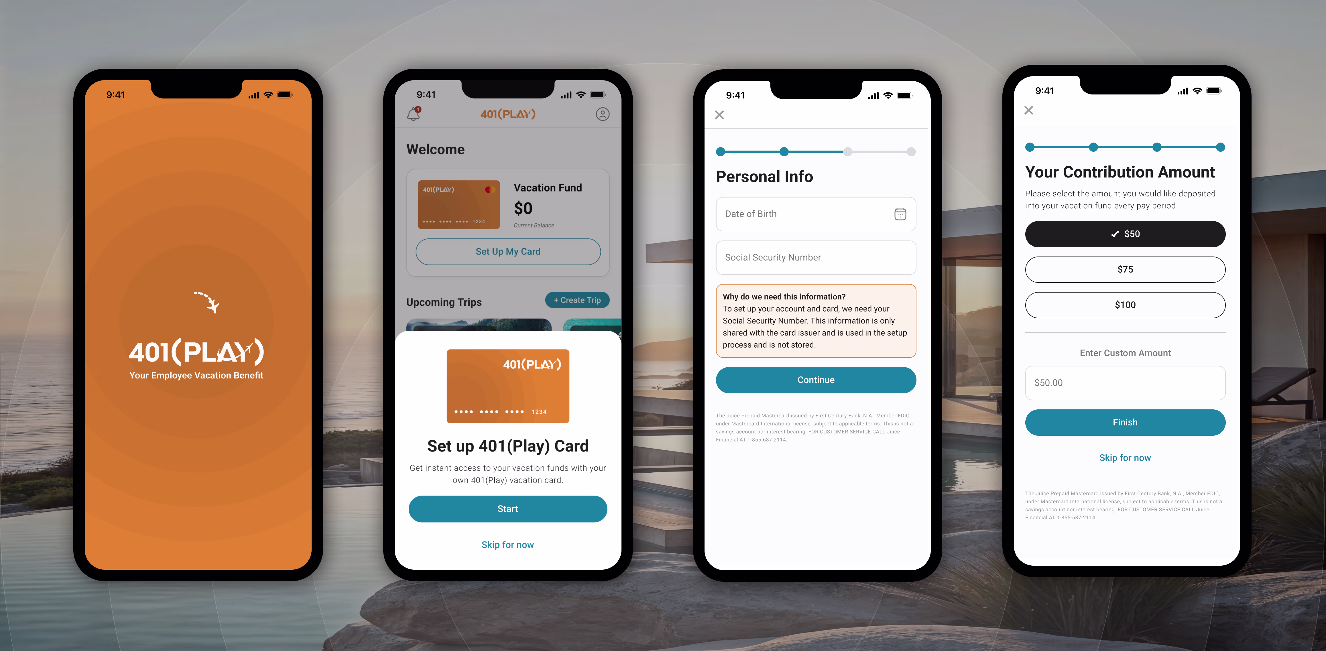
When users first log into the app, if they haven't signed up for their savings card, we initiate a sign-up prompt to guide them through the process.
In our analysis of successful travel planning apps like Expedia, TripAdvisor, and TripIt, we identified a clear trend: a mobile-first experience.
A mobile app offers convenience and accessibility, aligning with employees' travel and savings needs. By integrating 401(Play) into their phones, we reduced friction and enhanced regular interaction, making it a more intuitive tool for users.

The mobile app features an AI travel planner, access to local deals, the ability to create and save trip plans, and a vacation fund for travel savings.
The original app included a range of vacation planning, budgeting, and saving features, that added a lot of complexity to the UX. Without time for extensive user studies, we conducted quick, informal friends and family research, revealing that users were more motivated by a single, clear "savings goal" than complex budgeting tools.
This insight led us to simplify the app’s core function, pivoting from category-based budgeting to goal-focused savings, encouraging users to pull money directly from their paychecks to save for their trip. This approach helped to reduce development scope for V1 and better aligned the product more closely with observed real-world behaviors.

Simplified the app around a "Savings Goal" and integrated AI-assisted goal estimates to make creating the intial goal easier.

Basic admin web application gave clients ability to oversee their organizations benefit enrollment and monitor their employees throughout the enrollment process.
These are just a few highlights. If you're interested in a deeper dive, I'm happy to chat. Feel free to reach out and we can find a time to connect.


