Content Design
Digital Ad Design
Landing Page UI/UX Design
Webpage Development
1 x Designer / Dev (me)
Aug 2023 - Dec 2023
In my early career one of my core responsibilities was to design the ad creative, content, and landing pages for our marketing campaigns. I would always question how my work was impacting the campaign’s success, as well as the bottom line. This project was developed to quantify that impact, and uncover where both visual and UX design fit into those results.
I led the redesign and oversaw the development of the 1.0 Menu Printer application, focusing on expanding its design functionality and improving the overall UI/UX. Upon release we saw a ~40% increase in menu printing across our entire customer base while also eliminating the churn risk from all at-risk customers.

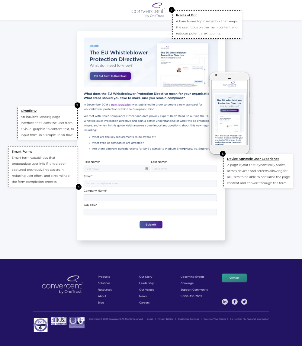
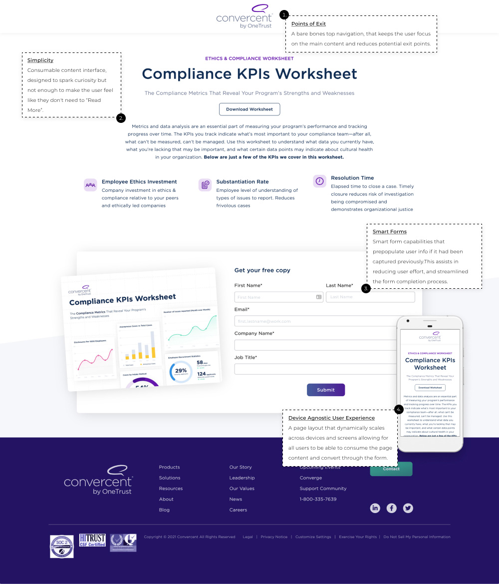
First, partner with our content marketers to design and develop content (self-assessments, guides, infographics, etc.) that served our target market and provided actionable value to whomever chose to download it. Second, design landing pages and digital ad creative that prompt user interaction and create a seamless visual experience across the entire campaign's user flow.


Easily drag and drop menu content into canvas.
Quickly identify overflow menu sections.
A key challenge was ensuring updated menu information still fit on a single, printable page. Previously, changes often caused content to overflow without notice, leading to unexpected reprints and time-consuming adjustments.
During the redesign, we identified the need for users to be alerted when content overflowed outside printable areas. This feature allows users to focus on menu updates while easily resolving overflow issues with minor tweaks before printing. The result: a more intuitive and efficient user experience.


Many of our customers expressed the frustration of writing quality wine descriptions for their menus. This indicated a lack of accessible resources or tools to create sommelier-quality descriptions.
As a quick test, we initially launched a wine description tool on our marketing site, which gained some quick traffic. This led us to test a beta version in our Menu Manager app, but it didn't gain much traction. As a result, we kept it as a lead generation tool, where it saw more use outside the app.

We developed a simple tool in Menu Manger app using early OpenAI API Chat completes, allowing users to generate wine descriptions with basic length control.
These are just a few highlights. If you're interested in a deeper dive, I'm happy to chat. Feel free to reach out and we can find a time to connect.
Understanding how a user interacts with the different elements of a marketing campaign (Advertisement, Landing Page, Content) helped me to align and optimize them to increase form conversions.
Examples of digital campaign ads. When designing digital ads it was important to understand its placement. Seeing how the “user” would interact with it, and optimize the design accordingly.