Customer Implementations Product Discovery
UI/UX Design
Prototyping
Design System Archetect
1 x Designer (me)
1 x Sr. Product Manager
2 x Software Engineers
Jan 2022 - Jan 2023
The Interactive Code of Conduct is a custom branded, responsive micro-site that enhances a code of conduct by adding web interactivity, flexibility, and engagement metrics. I was hired as the first dedicated design resource – but had the support of the broader design team on strategic decisions. I was tasked with scaling the new customer onboarding / implementation design process as well as lead redesigning the product UI/UX in partnership with product management.
Standardized core product design and made design templates for key artifacts lowering product implementation time by ~40% and contributing to ~2x increase in new product units delivered in 2022.
Interactive Codes of Conduct provide customers with a true measurement of how their employees engage with their code of conduct.
Prior to my involvement, each Interactive Code of Conduct (ICC) was custom, with each customer driving the product value in their own unique ways. This lead to many different product designs built around different product use cases, along with customers struggling to understand, capture, and communicate the product's value.
My goal was to research, analyze, and create a base design system template that included core product features that allowed us to deliver scaleable value to our customers. This would become our core offering that would be used in sales as well as a CMS dev template that would be uniquely branded and configured to streamline customer implementations.

Very high level aspiration process for the product redesign. Many if these phases happened synchronously.


Screenshots from some of the research interviews I lead. I began the sessions with scripted questions, but would hopefully transition into organic conversation.
I was responsible for assisting customers during product implementations, ensuring alignment between their requirements and our solutions, while collaborating with their branding teams for UI design.
I created a short research questionnaire to guide discussions with clients, enabling me to gain a comprehensive understanding of their challenges, current conditions, and desired functionalities.

Summarization of the information architecture exercise I underwent to better understand what types of pages our base product design needed to account for.
To create a base design that was flexible, I needed to analyze the structure of multiple codes of conduct and how they would best translate into a web information architecture. I found that there was a few key variations that we would need to account for in our base design.

High-level groupings from our affinity mapping exercise to help align the on product requirements.
To create a base design that was flexible, I needed to analyze the structure of multiple codes of conduct and how they would best translate into a web information architecture. I found that there was a few key variations that we would need to account for in our base design.
Employee engagement analytics were crucial for the product's value, however, customers struggled to interpret and communicate this data. Leveraging my web analytics experience, I developed a basic guide to track and understand key data points, which informed our product design and helped customers immediately access analytics value using default designs..
.jpg)
Site metrics are extremely valuable if you want to see your employee population as a whole when looking to compare / benchmark. The employee engagement story however, is woven between the relationship of page metrics and interaction metrics. One tells you how many employees land on a page, while the other tells you how many actually interacted with the page content.
Site Metrics example
Page Metrics example
Interaction Metrics example
After integrating some enablement into my customer implementations, along with aligning the core design to the data story, we began to see customers really understand and capitalize on the value of our analytics.
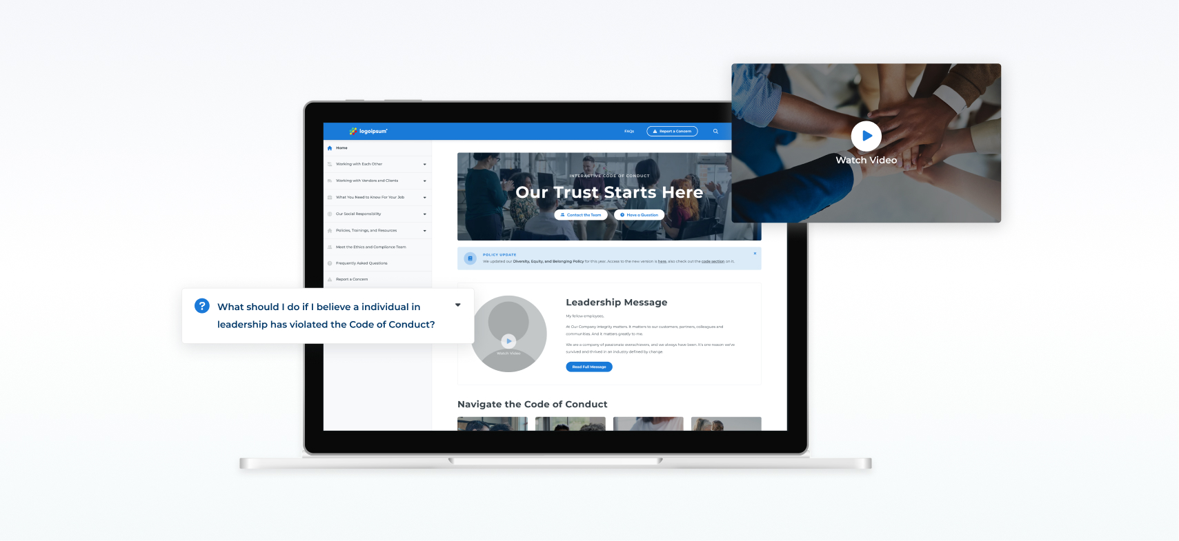
With a PDF code of conduct the user path through the content is linear, from top to bottom. This leads to lower levels of engagement and drop off as a user is unable to search for content or move through the code organically. Furthermore, they are extremely content heavy, with many different sections, child-sections, and in some cases grand-child sections. Our customers required a navigation that
We wanted our base product navigation to be flexible, so that it can scale to accommodate different customer codes for ease of implementation, along with having the features/functionality that allowed users to navigate and consume the code in a organic fashion.
Navigation UI elements
Final high-fidelity navigation solution components. The goal was that the base design would then be manipulated during a customer implementations to align to its brand. In order to allow for some customer choice, we offered two base navigation solutions, a sticky drawer and a slider drawer, both built off the same components.
As I starting to work on the product it was clear that there was a lack of a solid design language. Furthermore, there was no integration between the product and general brand languages. This became extremely obvious to me when I began implementing new customers and wanted to change the designs to represent the customer branding. Each design had to be started from scratch and aligned to the individual customer.
However, through the creation of a more consistent product design, I was able to utilizing atomic design principles to develop product UI elements, components, and page templates that can scale across brands. This helped me to drive efficiency within the customer implementation process and reduce my time spent on each customer design by ~1-2 weeks.
.jpg)
Various UI elements, styles, and layouts from the Figma template created to assist in the customer implementation process.
As I look back on this project and reflect, there are a few key areas of improvement I see.
First, usability testing. Much of the work done, was only tested amongst internal users prior to being rolled out to customer facing ICCs. I would have loved to take some time to really test our designs and assumptions across a wider spectrum of users to provide validation and data to back everything up.
Secondly, more extensive research into the core user. Much of our initial research came from customers and stakeholders, however the core user group is actually an organizations employees. To truly drive the value of this product more research needs to be conduct to see if our new designs actually keep employees interacted with the code of conduct and engaged with the content on site.

